I took these test shots for my ancillary texts on Wednesday 10th December, but didn't really have much of a plan or any ideas so they are quite unorganised and random.
Originals:
I like the idea of the artist having her back towards the camera and making a sign towards it like how she has done in the image by doing the peace sign. But because she is facing away, it looks like she is swearing which could reflect her rebellious attitude.
I also really like this idea of the artist looking up towards the sky. This illustrates her as angelic, due to how the light is shining onto her face, making her look sweet and innocent.
I did this shot so that it could be placed next to the shot that I have included below, and was also hoping to take an image with the artist wearing a shirt so that I could reflect both of her personalities. I will do this at a different time and edit this so that I can see if this idea will work or not.
This image didn't work very well because the artist looks like she is mid-blinking, which makes the photo look very funny and I think using this image would make the product look like a parody rather than a professional one.
These are the images I took with the artist on the opposite side of the shot, as I am going to edit one of these images with the above image and another one to make a three-piece image.
I think these look very flat and I don't like these shots very much. I was hoping to get an image that I could use to cover two sections of my digipak, but have decided against this idea unless I think of any better ideas to these.
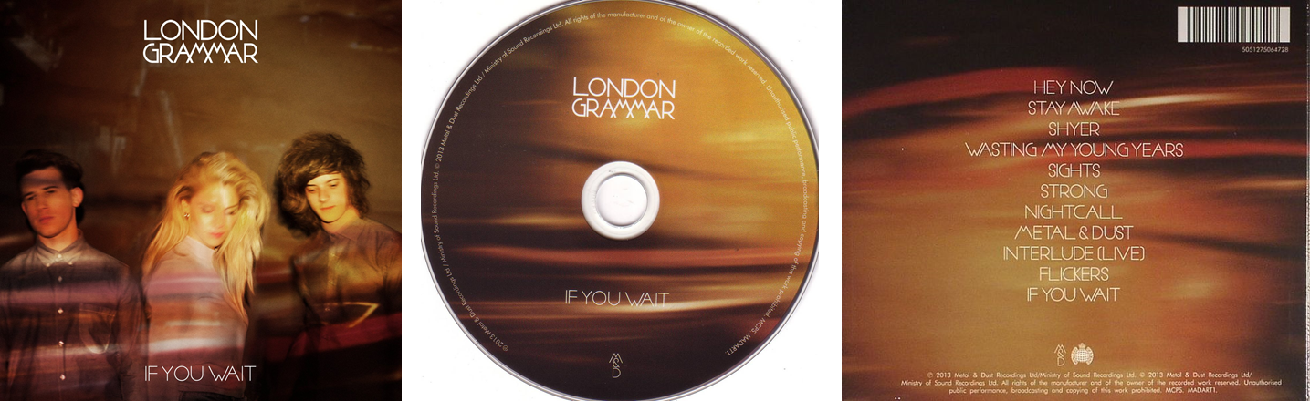
This was a shot that I was thinking that I could use on my back cover, with the tracklist on the blank side. This is quite conventional with albums due to the artist not wanting their face to be covered, and I tried to follow this convention. I like this shot and am possibly going to use something similar in my product, but am maybe going to use better lighting and a more dramatic pose to make it more appealing to the audience I want to purchase the album.
This shot was inspired by the artwork used on Ariana Grande's 'Yours Truly' back cover. I have decided that I won't edit this because I think it needs to have more depth and wouldn't work on the product I am going to create.
The artist has laughed in this image, causing the outcome of the photo having her smiling which is something I don't want in my product as I want her to look expressionless.
I took these two similar shots with different lighting to see which one I preferred. I really prefer the first image because of how intense and dramatic the shadows are, which is an aspect I would like to include in my product.
I really love this image and it is one of my favourite shots from this day. I think that the artist looks really fierce and this is part of her personality I want to be displayed through the product. This is reflected in the song I am doing (White Teeth Teens) due to her being one of the 'unpopular' girls, and figuring out what she really wants and leaving with a positive and clear mind.
These 2 images are the two that didn't have any impact on me when deciding which shots to edit. This is because they were unplanned and don't have any reasoning behind them. In the first image, the artist was sorting out her hair but I thought I would quickly take a photo of her doing so as this would show her in a natural light. I think this photo doesn't look good and can tell it was unplanned due to her not being in any way posed. In the second image of the artist, she looks scared as I had put my flash on on my camera and she was surprised by it.
Edits:
I love how this image turned out, due to how it reflects the artist's fierce and strong personality. I think this would look good either on the CD or as the part that goes behind the CD on the case. I edited the image into black and white as I think this makes the artist look better because the outfit she is wearing distracts your eyes. I think that the black and white editing also emphasises the shadows within the image which illustrates her fierce attitude due to how it gives her even stronger cheekbones, connoting power and strength.

I edited this image in a similar way in that the 'Halcyon Days' cover is edited as I think this looks really interesting due to the bright colours used, which contrast with the artist looking away from the camera. I decided to use a light blue/green colour in my edit to create a calm effect, but I don't think this worked very well because the image is in colour so the outfit and the gradient clash. I still like this idea but need to take an image that is similar to the way Ellie Goulding is posed, as this is a lot more dramatic and looks a lot better and more interesting.

I am planning on having this edit include another image of the artist, but this time in a shirt so that it reflects both of the artist's attitudes and opinions towards popularity. I have purposefully placed the artist in bright clothing on either side of the shot looking outwards, as I am going to place the artist in a shirt either looking directly at the camera or slightly past it. This is because I want the image to illustrate how she is comfortable with not being popular, and that this idea is the central one.

I took the middle image on this photo in the second shoot that I did, as the first shoot I did wasn't very planned. This is the final outcome for this image, and I really like the way it has turned out as I think it is a really effective image. One thing that I dislike about the outcome is that the middle image doesn't stand out as much as the other two images because I think she looks bored, which makes it less effective. If I was to do this image in my final product, I would plan it a lot better to ensure I ended up with the effect that I want, and would make the images similar sizes and pose the artist in specific ways to illustrate a message.
I think this image works really well, and am looking forward to editing this so that it looks really effective. I love how the lighting is really harsh on the left side of the artist's face, as this makes the right side look even darker and gives it more shadows. This gives the effect of 2 personalities or ideas, and this is something I want to include when making my product.
These shots were my attempts at creating a hair flip image. Some of the shots didn't work because I asked my friend Amber to hold Chloe's hair and then let go so I could capture the hair mid-fall, which also captured Amber's hands in one image and it was difficult to time it right so the artist's hair sometimes looked flat, or only had a little flick at the ends of her hair. I also asked Chloe to flip her hair herself, but this caused her hair to blur and didn't create a good image.
I captured 3 images for this particular little section because I wanted to have a few images to choose from when editing. The top two images where Chloe is looking to the sides aren't as effective as the bottom image because this one creates a more direct address to the audience. This is the image I am going to edit because I think this one looks better.
When editing these images, I am going to place them together so that there is three of the same person in the same image. I think this will look really effective because there will be 3 of Chloe, creating an illusion. In these images, I think there is too much negative/blank space, which makes the image look unprofessional and unorganised.
I like how this section of images turned out because I achieved what I intended to do, which was to capture the artist's hair in a way that illustrates it in a flowing motion. One thing I don't like about these images is that I had to use a chair for the artist to sit on so that she could lean back and make her hair go in this position. The chair had to be used because I asked the artist to try doing this pose standing up but it was too difficult for her and it hurt her back too much.
Edits:
I really like this shot and think this would look good as an album's disc image, because I think it would look good if I split the image in half and reversed the way her face would usually be seen. For this, colour would look best because then it is easy for the audience to distinguish what it is an image of because the black and white image makes the shadows even darker so it makes it almost impossible to figure out what it is an image of (as seen in the image below). I also think it would look effective if I used it for the front cover of the album, although I want the front cover of my product to have an image that is a lot more posed and which contains more than just the artist's face as this is a lot more conventional than having only the artist's face in it.

If I changed the background colour so that they both matched, I think this would look really effective and would illustrate the 'split personality' aspect of the album. This is because of how I have parted her face into two sections, and they are both different in the way I have used the lighting as she has a light side of her face and a dark side. This is used to show her positive and negative attitudes towards things. I think this would be a good thing to use in my product because it breaks conventions, due to how the CD usually only contains the title of the album and maybe also the artist's name.
This edit wasn't very easy to do because capturing the artist's hair mid-movement and not capturing the blur it created was too hard to do. This made the image look very still and doesn't look very effective. If I want to use this type of image in my product, I will have to use something like a fan to make the artist's hair flow without having to physically touch it.
This isn't an image that I intend to use in my product because I think it looks really boring and dull. One thing I love about the image is the way the black and white edit has made the artist stand out against the white background, although I think the artist looks really flat and doesn't look appealing. I think the reason for the image I have edited looking flat is because the professional album by Foxes is a lot more posed, as she has had her hair styled in a dramatic way for a specific effect.
I really like this idea of using multiple image of the same person and manipulating them so that there appears to be more than one of the same person. This reflects the split personality of the artist and I think I could use this to illustrate the meaning of the album. I think this edit doesn't look very good though, due to the fact I have had to move the individual images which has created lines that I do not want in my product.
I really love this idea and think it would work really well on my product. I love how interesting it looks as it is very unconventional for an album to have it's tracklist displayed like this. For my product, I think an image of the artist's arms or something would work better, as I think this image doesn't reflect the lonely theme I want the album to create.